Formula 1 explainer

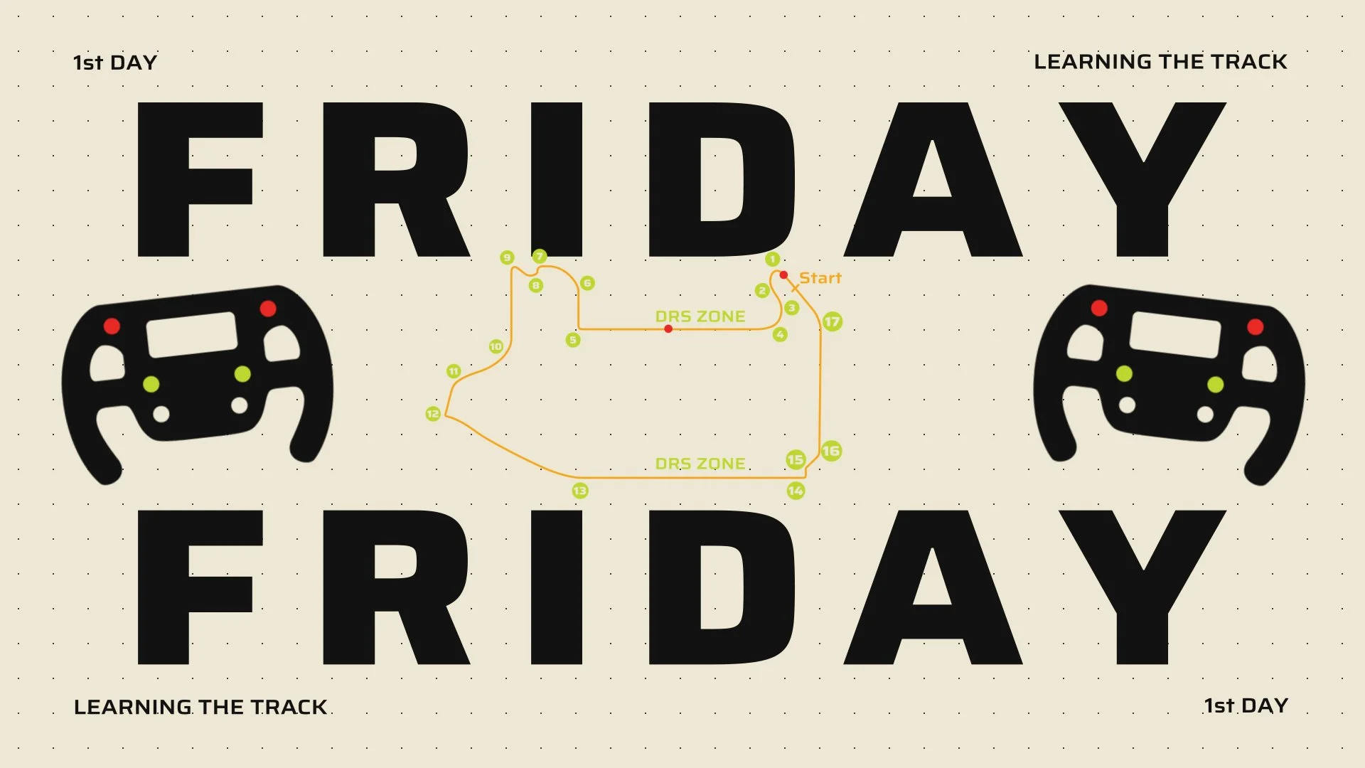
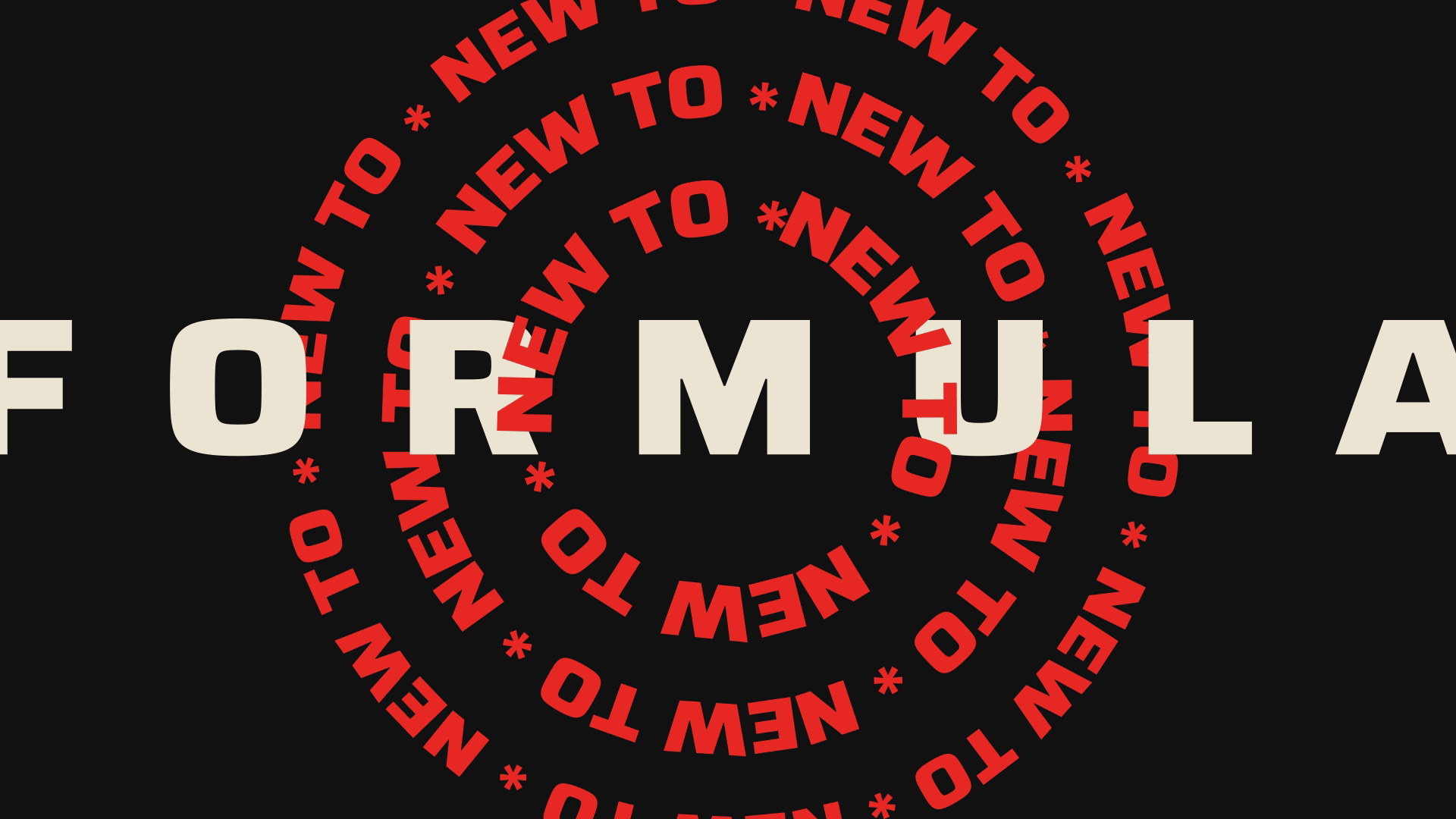
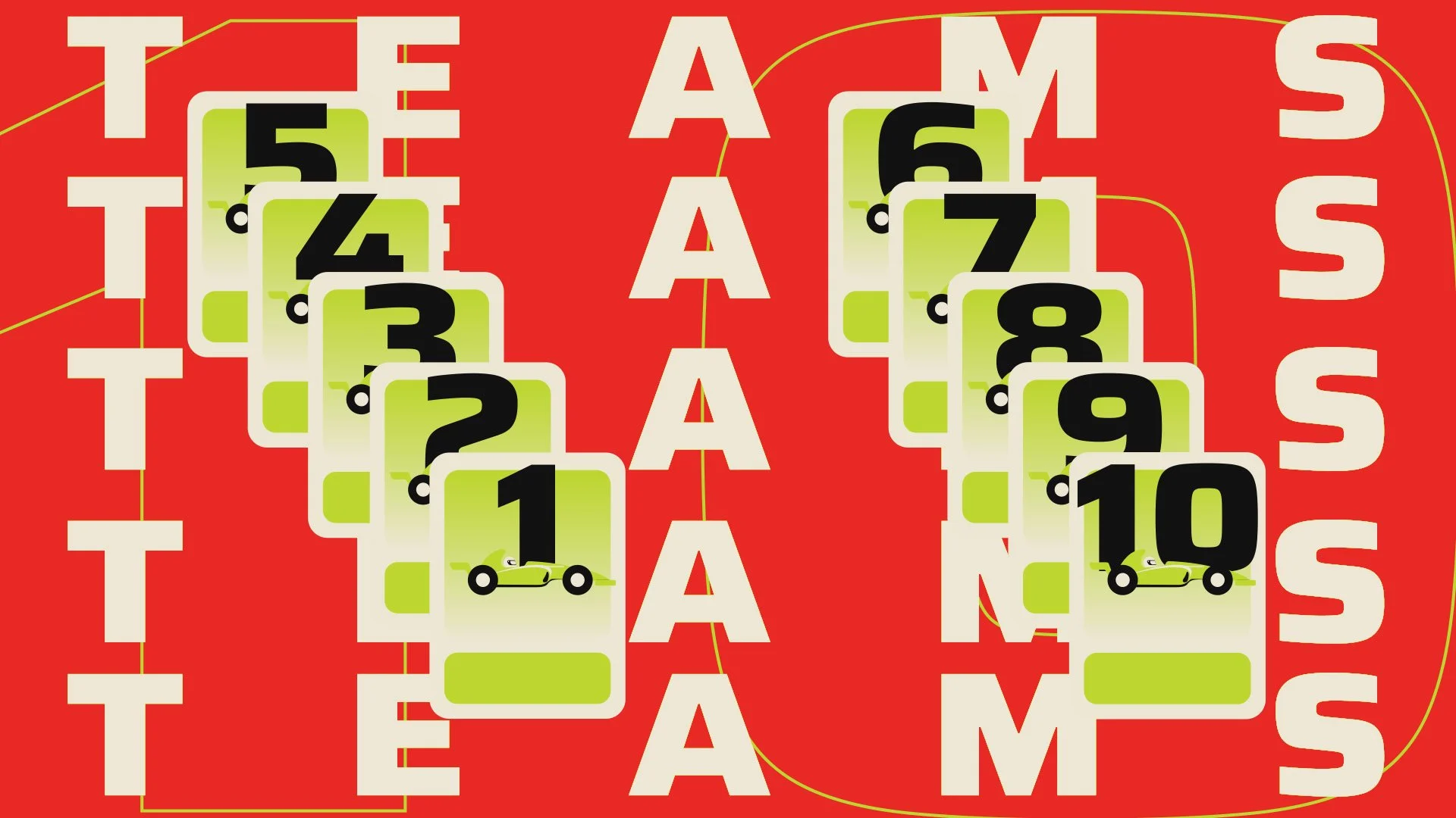
A short, high-energy animation that breaks down the excitement of Formula 1 through bold typography, sharp transitions, and sports-inspired visuals.

Designed to make a complex subject feel clear, dynamic, and engaging.

Quick project facts (small text boxes):

Type: Personal Project

Style: Bold type + flat illustration

Duration: 2 weeks

The challenge

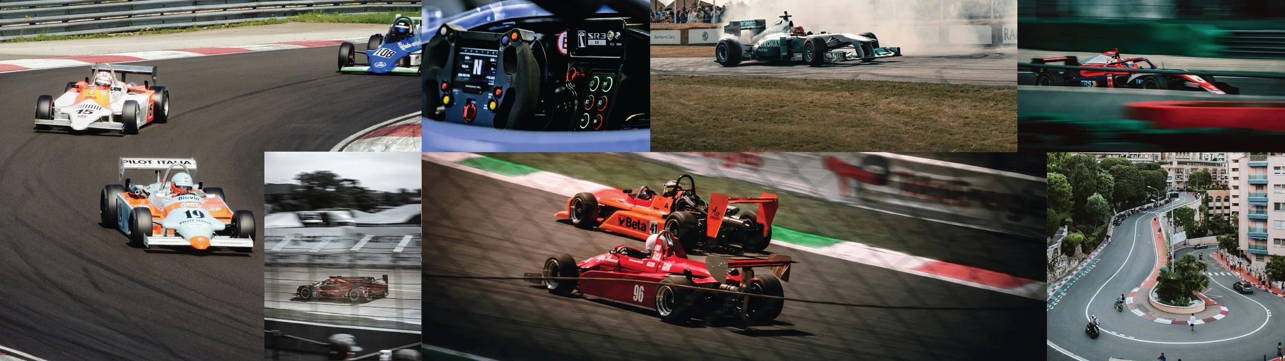
Formula 1 was never really “my thing.” I knew the cars were fast, the races dramatic, but I wasn’t a fan. That changed when I saw the Monaco Grand Prix live. The speed, the strategy, the noise - it was impossible not to be captivated.

That experience sparked a question: How do you capture all of that intensity and complexity in just a few seconds? My goal was to create a short explainer that made F1 approachable for beginners, while still feeling punchy, bold, and fun.

My approach

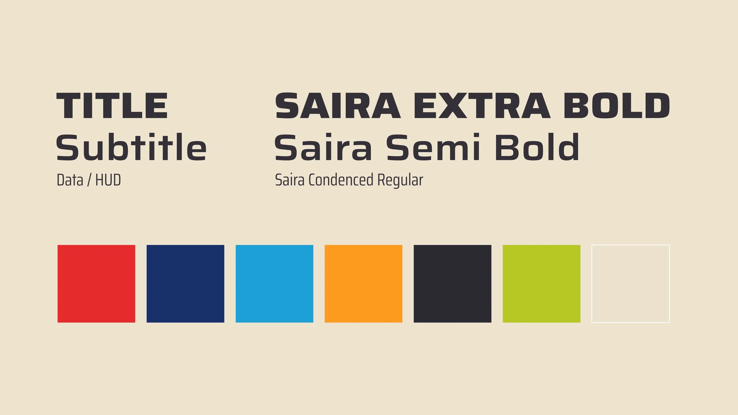
Instead of sketching layouts on paper, I dove straight into typography and color. For me, type isn’t just about words - it’s rhythm, movement, and energy. It became the backbone of the piece.

Research deep dive:

I spent time understanding the sport: rules, qualifying formats, pit stops, lap strategies. This research shaped not just the script, but the pacing and flow of the visuals.

Design direction:

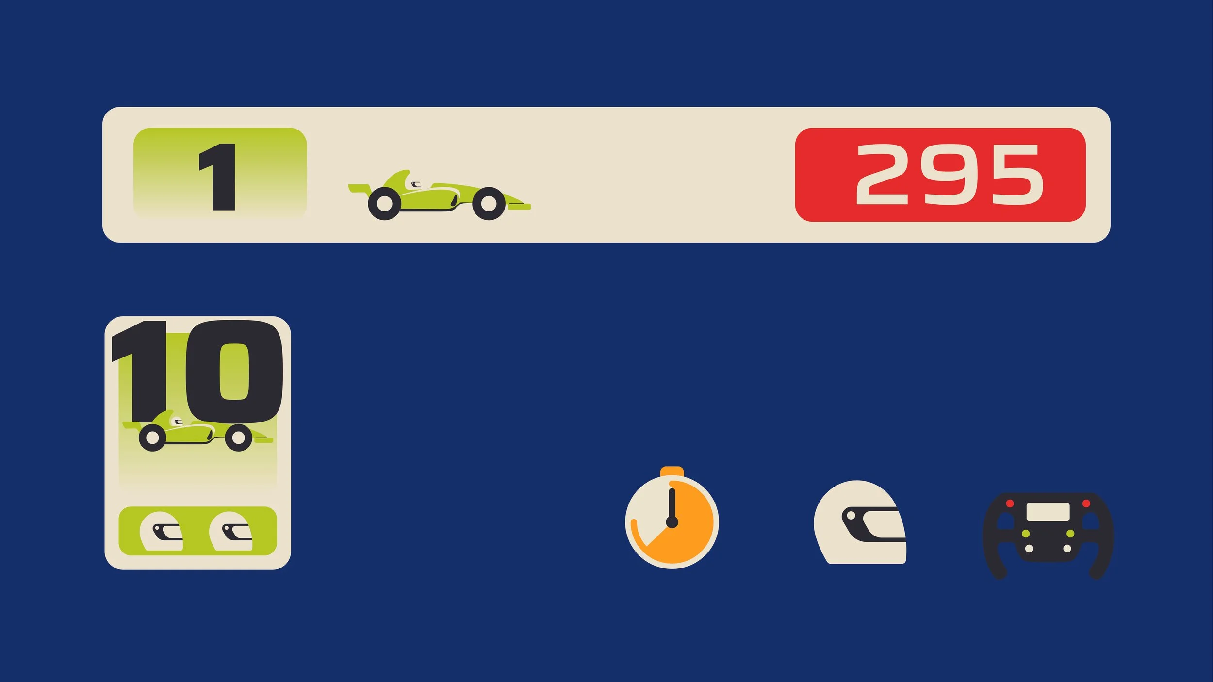
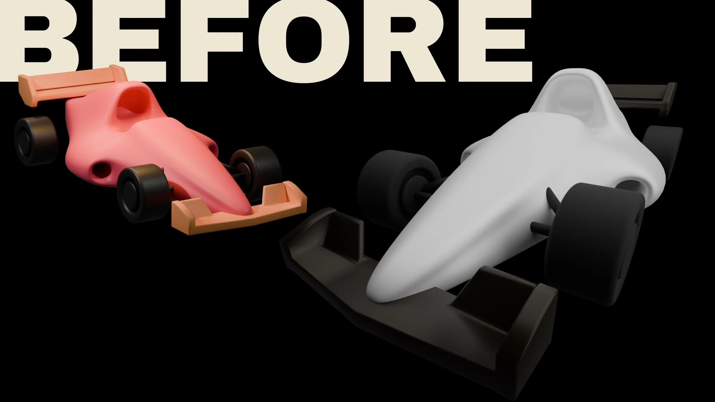
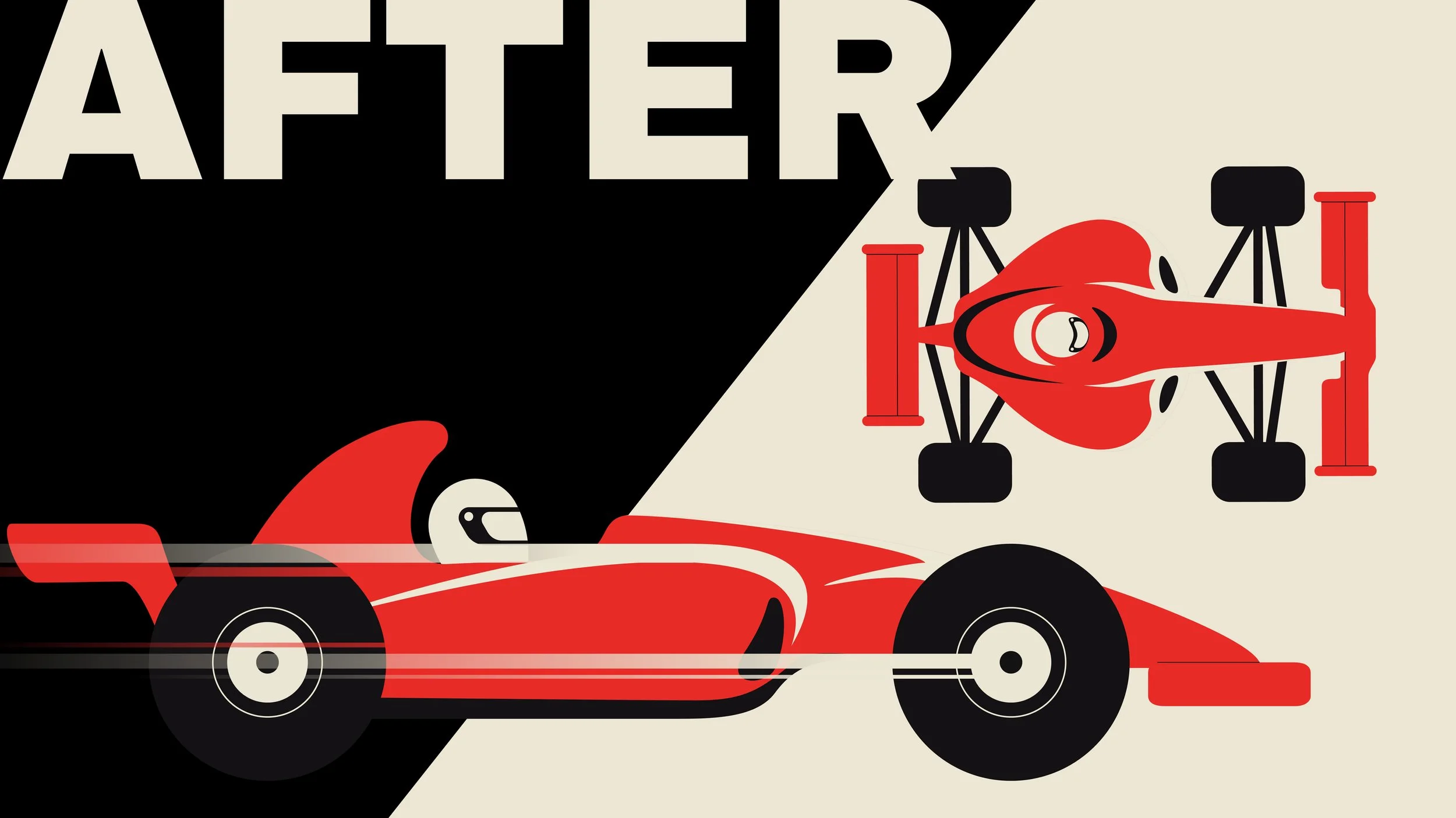
I experimented with different looks, even starting a 3D car model, but it didn’t feel right. In the end, I chose flat, toy-like illustrations of the cars - playful, easy to read, and a strong contrast to the sharp, bold typography.

First layout ideas

*

First layout ideas *

FINAL DESIGN

*

FINAL DESIGN *

Animation:

Motion was built around the rhythm of racing: quick wipes, sudden cuts, zooms, and bursts of speed. Each transition was designed to echo the feeling of acceleration and intensity on the track.

The solution

The final animation is a type-driven explainer that simplifies F1 into bite-sized, engaging visuals. Bold typography delivers the facts, while stylized flat cars and fast transitions keep the energy high.

The result is part education, part entertainment: a motion piece that feels modern, clear, and fun, even if you’ve never watched a race before.

What I learned

This project reminded me why I love passion projects:

They push you to research and adapt. (I went back and forth refining the narrative until it really clicked.)

They encourage you to experiment with style. (I let go of a detailed 3D approach to embrace a minimal flat one — and it worked better.)

They evolve in ways you don’t always expect. (Some frames stayed true to my first ideas, while others changed completely as I iterated.)

Final output

The impact

What started as a personal exploration became a showcase of how motion design can turn a niche subject into a compelling visual story.

This project is proof that motion design isn’t just about making things look good — it’s about making complex ideas feel clear, dynamic, and exciting. Whether it’s sports, brands, or abstract concepts, the right mix of typography, rhythm, and style can transform the way people understand and connect with information.

I turn complexity into motion that feels simple, clear, and fun. Let’s chat about your project,

let’s talk!

Get in touch!
Next
Next

Tarot Alive